Designing a Seamless Shopping Experience for Playcadia

Improving a gaming store's navigation and transparency to boost conversions by 40%.

Role

UI Designer

Industry

Ecommerce

Duration

2 weeks

a cell phone on a bench

A functional and conversion-driven e-commerce experience needed

The gaming store sought to translate its passion for video games into an engaging and seamless online shopping experience. While the brand had a strong identity and clear mission — connecting gamers with both popular and rare titles — it lacked a digital platform that reflected this spirit. The challenge was to design a user-centered e-commerce flow, starting with low-fidelity explorations in Figma from a Shopify template and evolving into a high-fidelity prototype ready for development, ensuring usability, visual appeal, and conversion efficiency.

Challenges

  • Categorization and navigation system
    The main challenge was adapting a Shopify-based structure to support the store’s diverse catalog, spanning titles for Sony, Nintendo, Microsoft, SEGA, AMIIBO, and Neo Geo platforms. This required organizing the product categorization and navigation system to make it easy for users to browse, filter, and find specific titles.

  • Labeling
    Another key challenge involved designing product detail labels that went beyond the basic description, including the physical condition of each used game (with or without original packaging, CD or cartridge format, and inclusion of the instruction manual).

Ideation

The Shopify based theme: an overview of Prestige

The Prestige theme was created for high-end Shopify online stores, boasting a luxurious and polished design. It also offers advanced customization options, multiple layout styles, and sections to elegantly showcase products. Prestige is a popular choice among fashion boutiques, jewelry stores, beauty and cosmetics brands.

The main key features offered by it that made it a good option were:
  • Customization options

  • Responsive design

  • Built-in sections

  • Fast loading speed

a cell phone on a ledge
a cell phone on a bench

From structure to flow: starting with low-fidelity wireframes

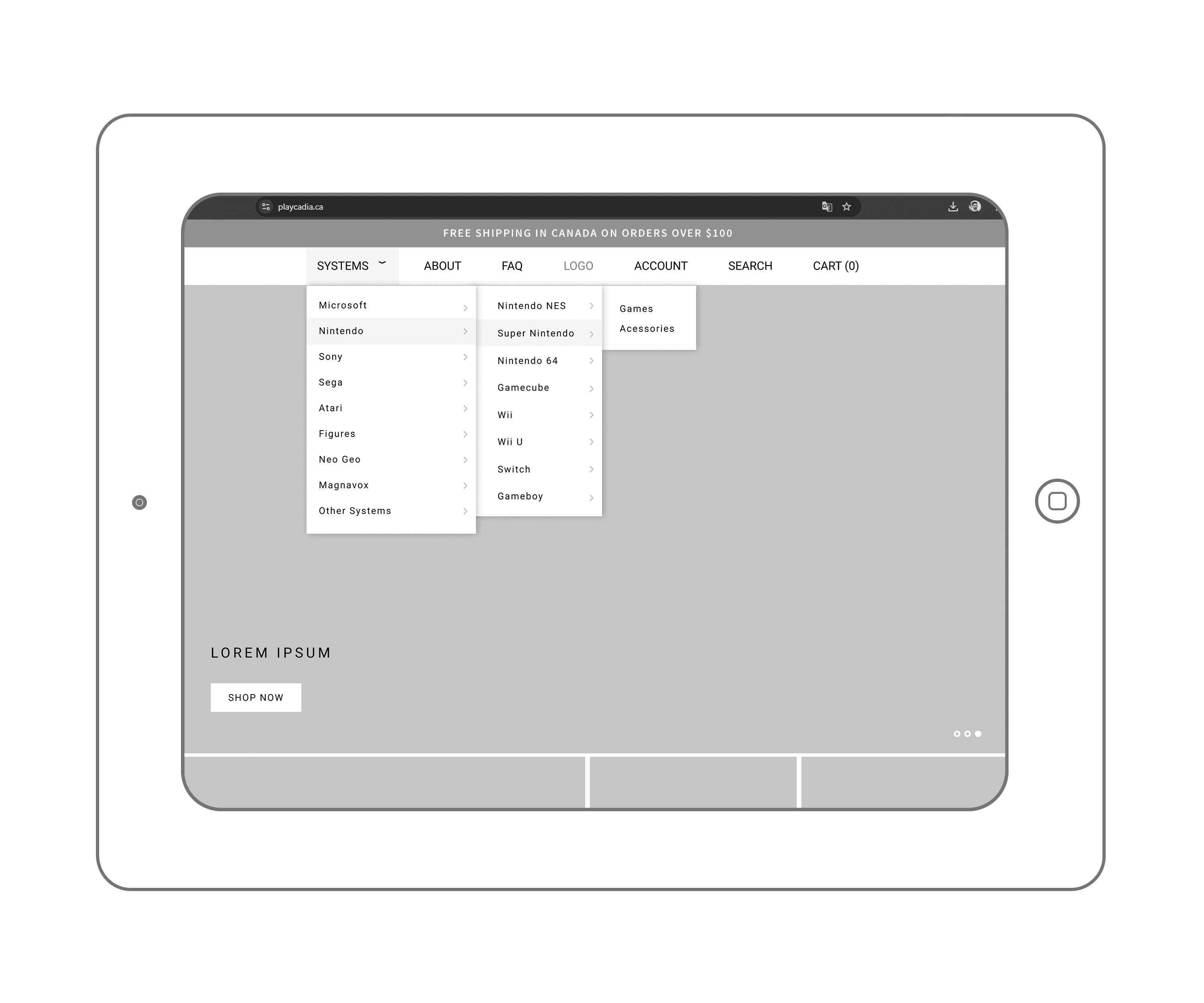
After defining the theme and understanding the platform’s structural constraints, the design process began with low-fidelity wireframing in Figma.

First of all I structured the navigation into three hierarchical levels to help users browse the large product catalog efficiently:

  • SystemsConsoleGames / Accessories.
    This organization ensures intuitive exploration and quick access to specific categories within the store.

a cell phone on a table

Expanding the wireframes

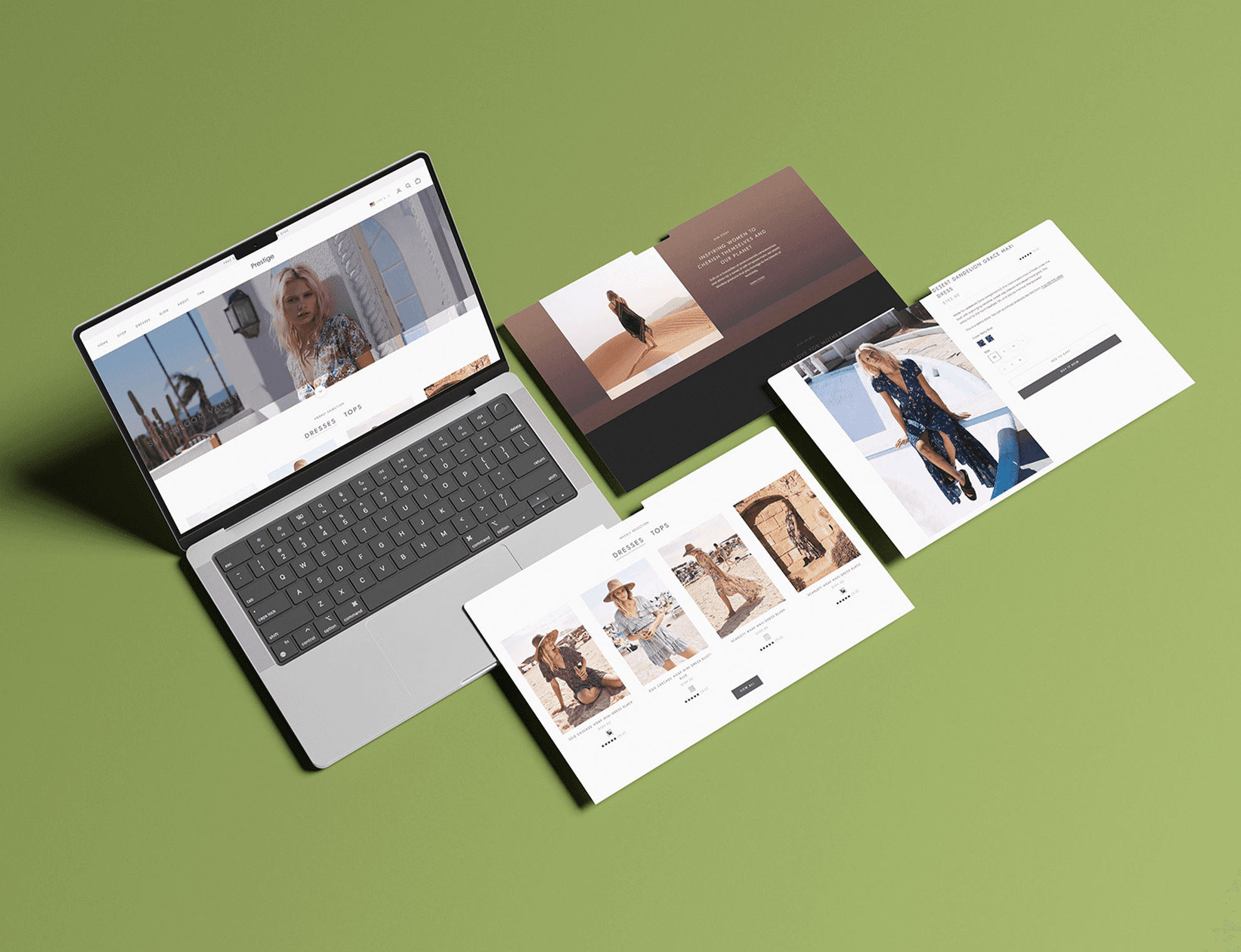
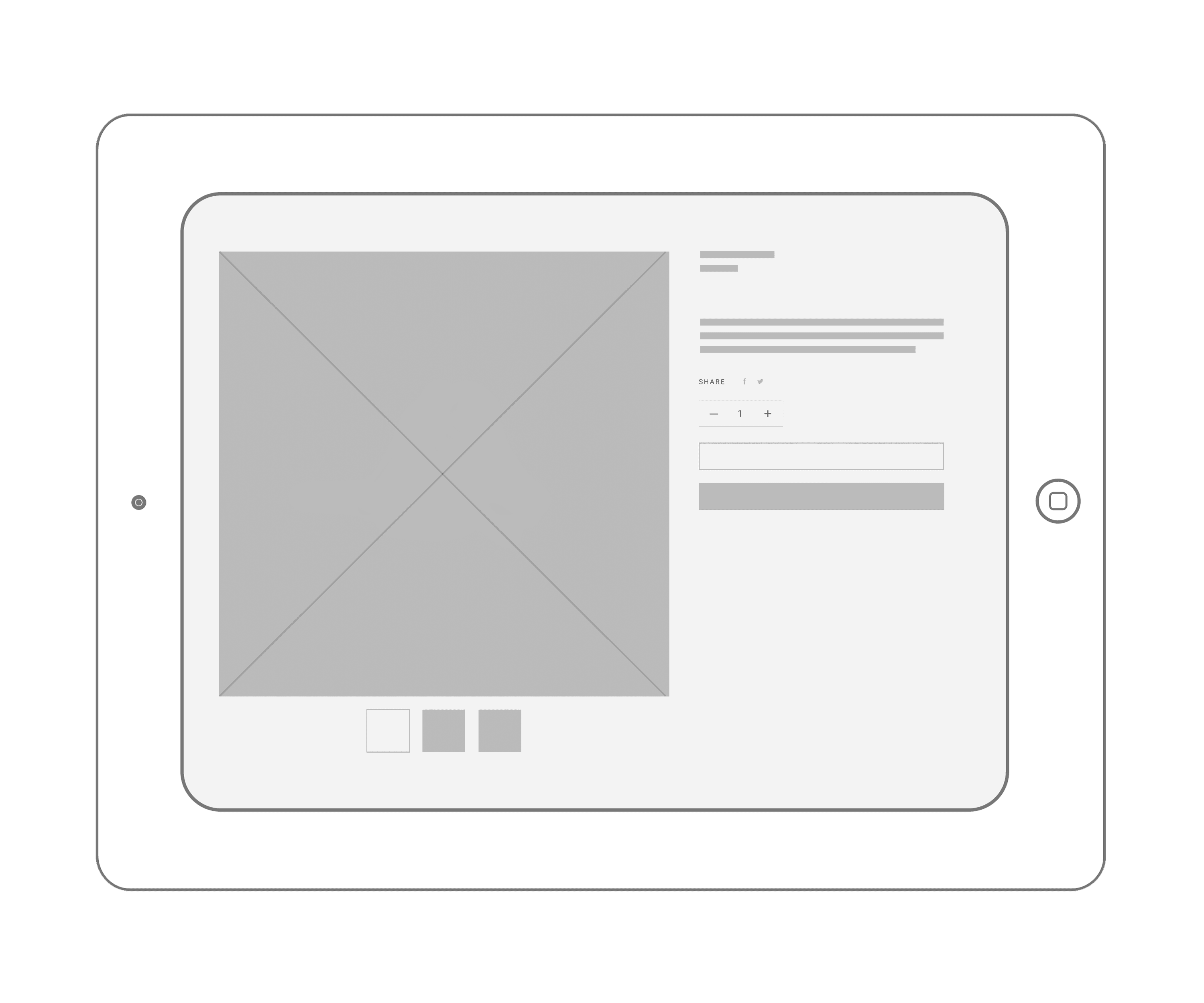
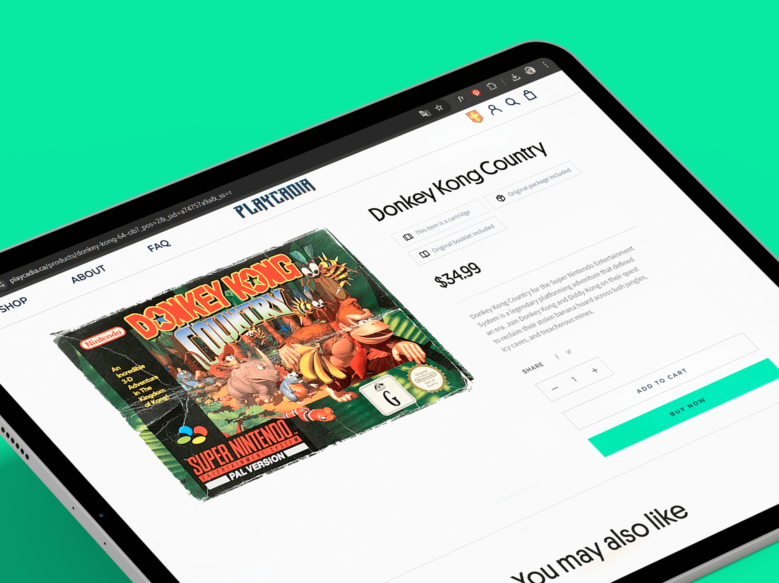
After structuring the main navigation and information architecture, I proceeded to design other key screens in low fidelity: the homepage, collection page, product page, and about page. These explorations allowed me to validate layout hierarchy, product visibility, and consistency across pages before moving to high-fidelity design.

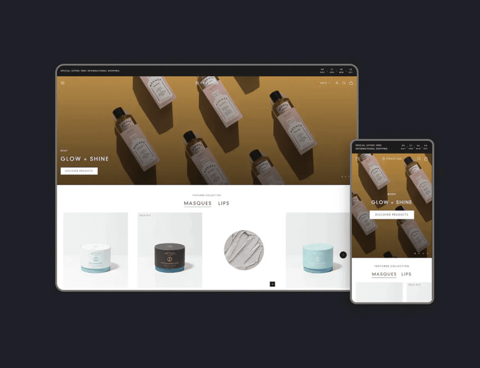
High-Fidelity prototyping

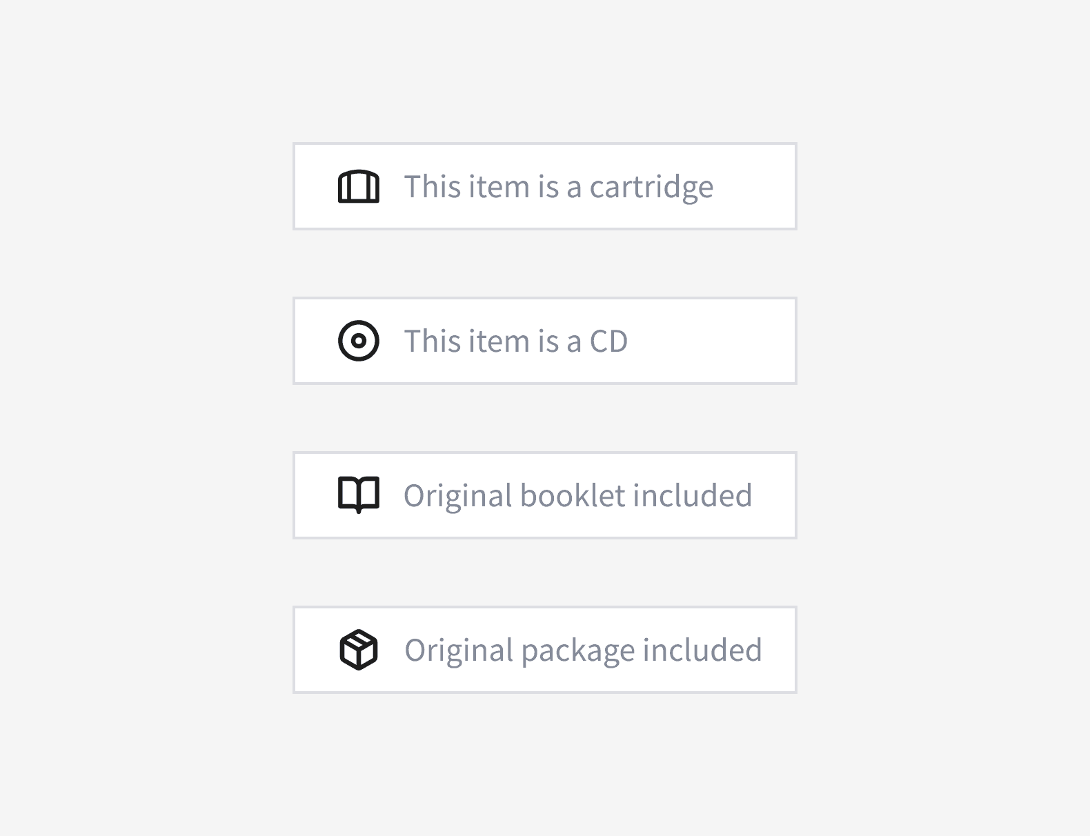
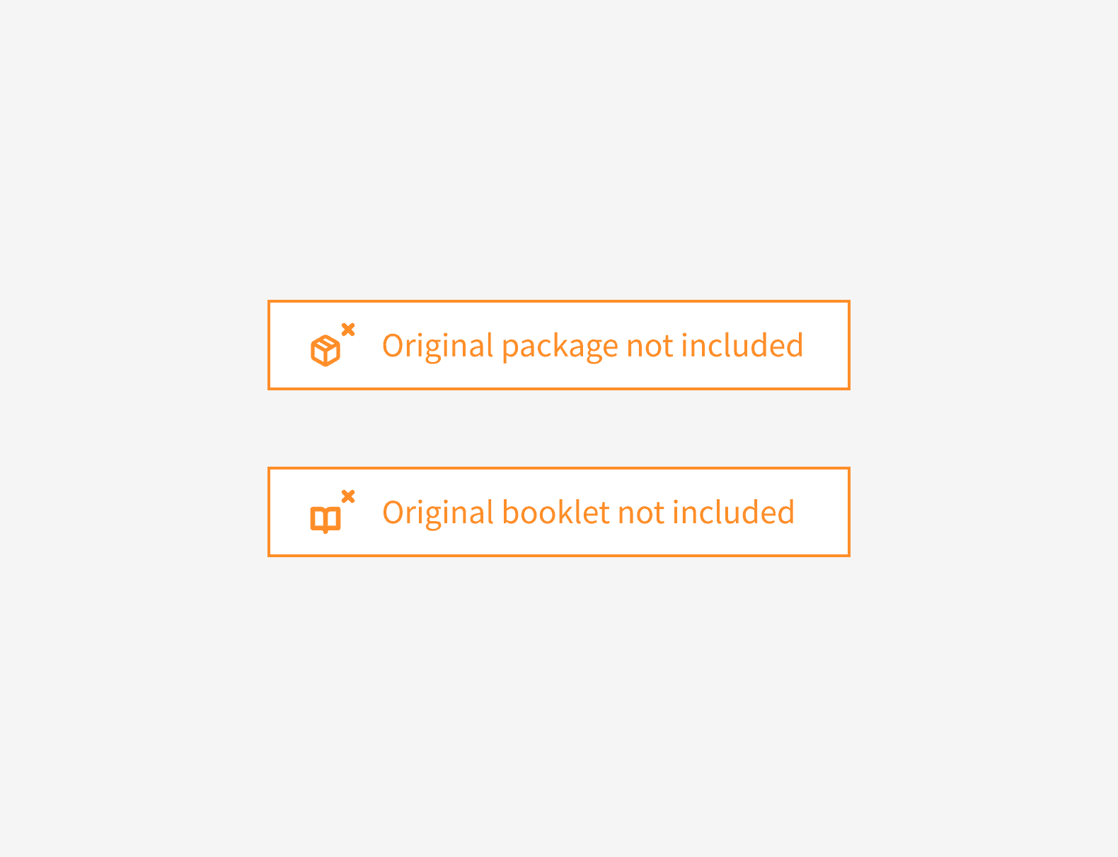
Once the structure and navigation flow were validated, the focus shifted to crafting the visual layer. The high-fidelity prototype refined hierarchy, contrast, and overall readability while maintaining a cohesive visual identity consistent with the theme’s foundation. Each element, from product cards to the information layout on the product page was carefully detailed to ensure alignment with the development team. The final prototype was then handed off through Figma.

Labeling system

To enhance clarity and support collector-oriented purchases, a set of visual tags was designed to indicate key product attributes, such as format (cartridge or CD), packaging condition (with or without box), and manual availability.

These tags were integrated into the product page layout to make browsing faster and more transparent for users.

Outcomes

The new information architecture and three-level navigation system brought clarity and consistency to the browsing experience, making it easier to explore a large and diverse catalog. Also, adding detailed product labels, describing condition, format, and packaging, increased transparency and trust. These implementations together contributed to a 40% increase in conversion rates, demonstrating how design-led decisions directly impacted usability and business performance.

Other projects

Copyright 2025 by Luiz Avanzo

Copyright 2025 by Luiz Avanzo

Copyright 2025 by Luiz Avanzo